
THE PROBLEM
Lecercle by Pernod Ricard carries the finest of wine and spirits E-commerce, but its design looks outdated compared to its competitors and part of its user experience needs further enhancement to cater to a member section exclusively. An overhaul is overdue and will ensure Lecercle by Pernod Ricard remains competitive in the long run.
THE SOLUTION
We set out to create a brand-new design structure and layout to ensure that the site can cater for non-member and member browsing on a single site while it encompasses best-in-class usability and aesthetics across all corners of the site.
THE ROLE
I led the project and worked on all aspects of the new website design structure, including its visual and user experience. I also revamped the UX of key pages while my developer colleague helped implement my designs.
ROLES
UI/UX Designer
RESPONSIBILITIES
Research
Competitor Analysis
Sketches
Wireframes
Interface Design
PLATFORM
Web/Ecommerce
TOOLS
Pen and Paper
Adobe XD
Photoshop
Internal meeting and discussion session
We kicked off by having an internal discussion on the project brief, aligning the team on the project brief, getting feedbacks and information answered as much as possible, and to scope out the project.
The main concern from the client is incorporating a member-only section whereby a user who isn’t a member (public) is unable to see it on their browser.
To wrap things up and conclude for the project task: The task was to make a complete redesign of the website and to incorporate a new user experience for exclusive member-only section whereby non-member/public aren’t able to see it.
Goals? Ideas? Questions?
During the meeting, we briefly created goals and a strategic direction to achieve them. These are things that we randomly share based on everything discussed during the internal meeting. Each idea is as valued as it is.
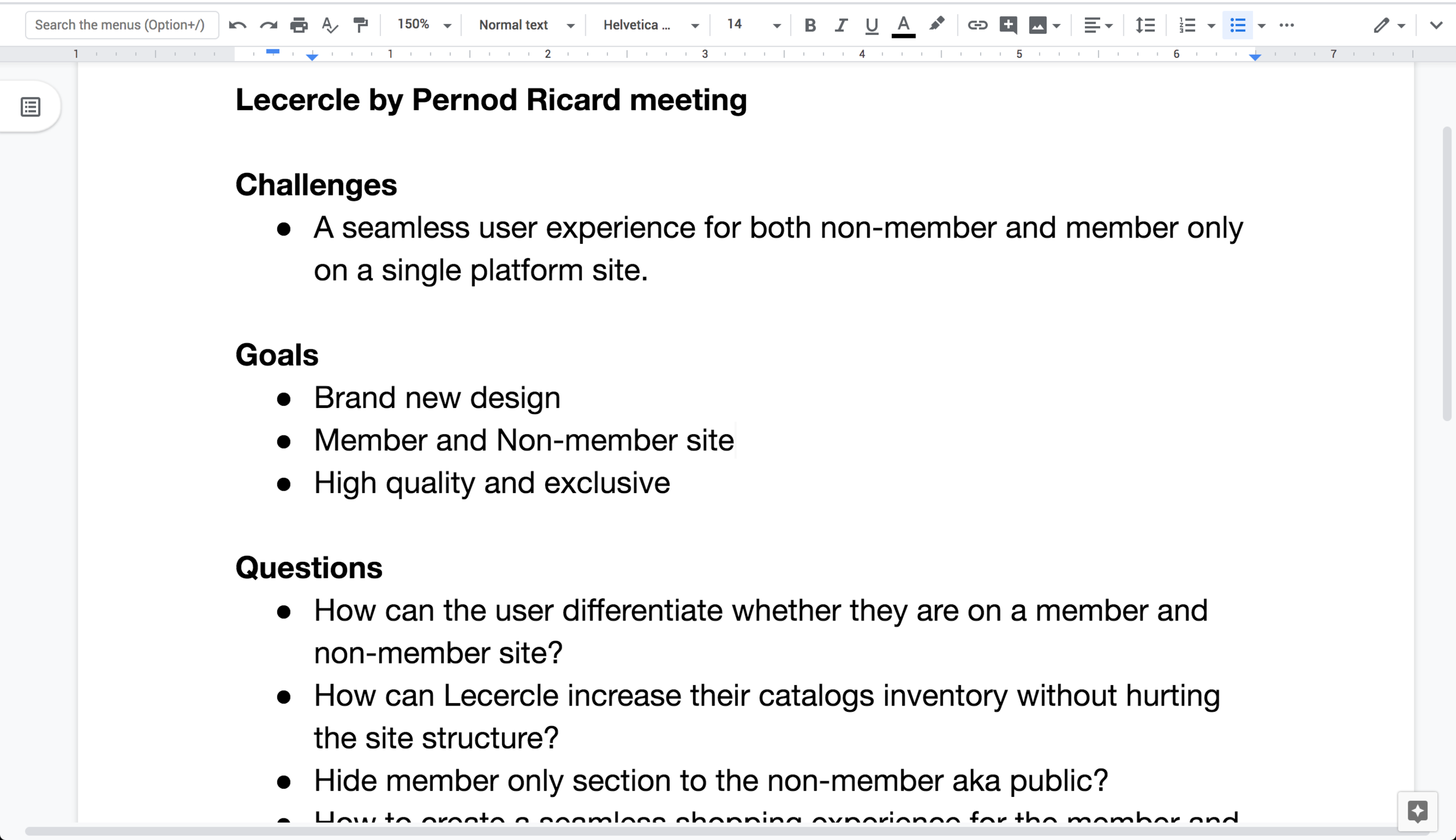
The main goals and concerns for us were:
A single website that can cater to both users that are not a member who are the general public traffic and also to users who are members.
How to hide the exclusive section that is only for member, without adversely affecting the user experience and overall aesthetic outlook to a non-member.
Can we make the experience pleasant for both the target user on a single website.
Information Architecture
The client sent us their sitemap which helped us understand the flow of the product. Since it’s a large-scale project, the project scope is broken down into three phases.
Phase 1 consist of:
Designing the UI components
Home Page
Event Listing Page
Event Page
Product Listing Page
Product Page
Cart Page

Design and Web Research
During this stage, I searched for well-designed websites for reference and bring it back to the team.

I used sites like awwwards.com, ecomm.design and Pinterest to find inspiration for the design. The client has websites that they personally like which are mostly clean and simple. With their preferences in mind, I did some research and discovered certain aspects about it such as minimal colour, a grid-ed layout and images. These things inspired how it would later end up in the design.

Sketching and Ideation
The next step was to start on the first concept. I sketched the concept and then went back to the team to get their feedback. Based on their feedback, I returned to sketch the second variation with the aim to get as many feedback as possible so that it meets the project goals and their preferences as a user before I dived into the designing work.

This is variation 2

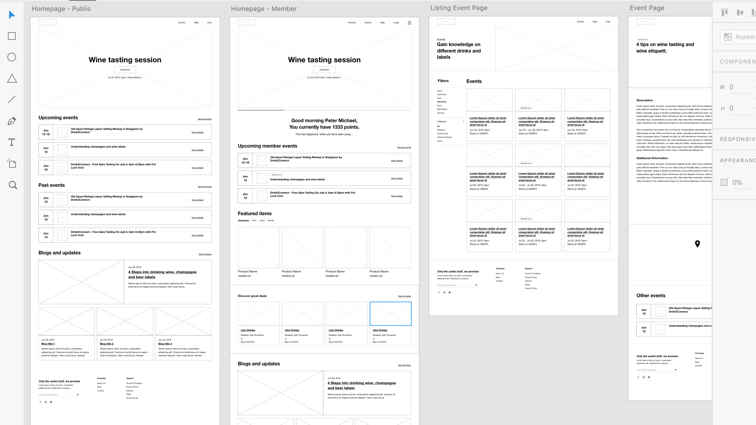
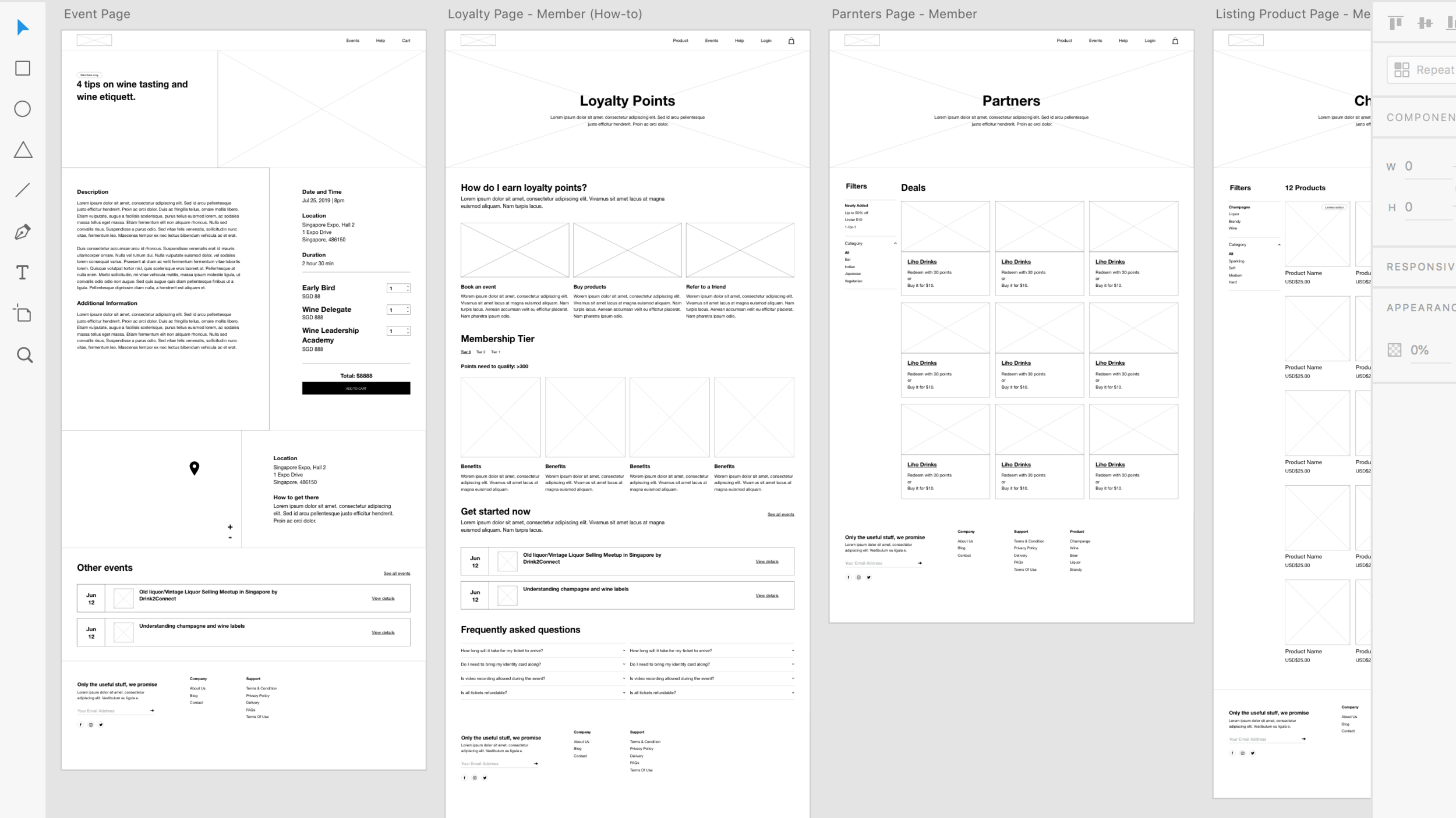
Finalising and wireframing the concept
Based on all the feedback from the team, I then moved forward to creating the wireframes. At this stage, I decided to focus more on the content story flow and how the site will look like to the “members-only” and “non-member” user without degrading the experience and look of the website.
My screen design tool of choice is Adobe XD. I started by sketching on the piece of paper which translated into low-fidelity wireframes in Adobe XD.


Feedback from client
At this stage, we wanted some feedback from the client and thus, we sent over our first-draft of wireframe. To make sure that we get rich feedback from the client, we made the website at this stage as detailed as possible and that includes the content flow and the appearance of the page to both non-member and member-only users.
Incorporating the brand style guide
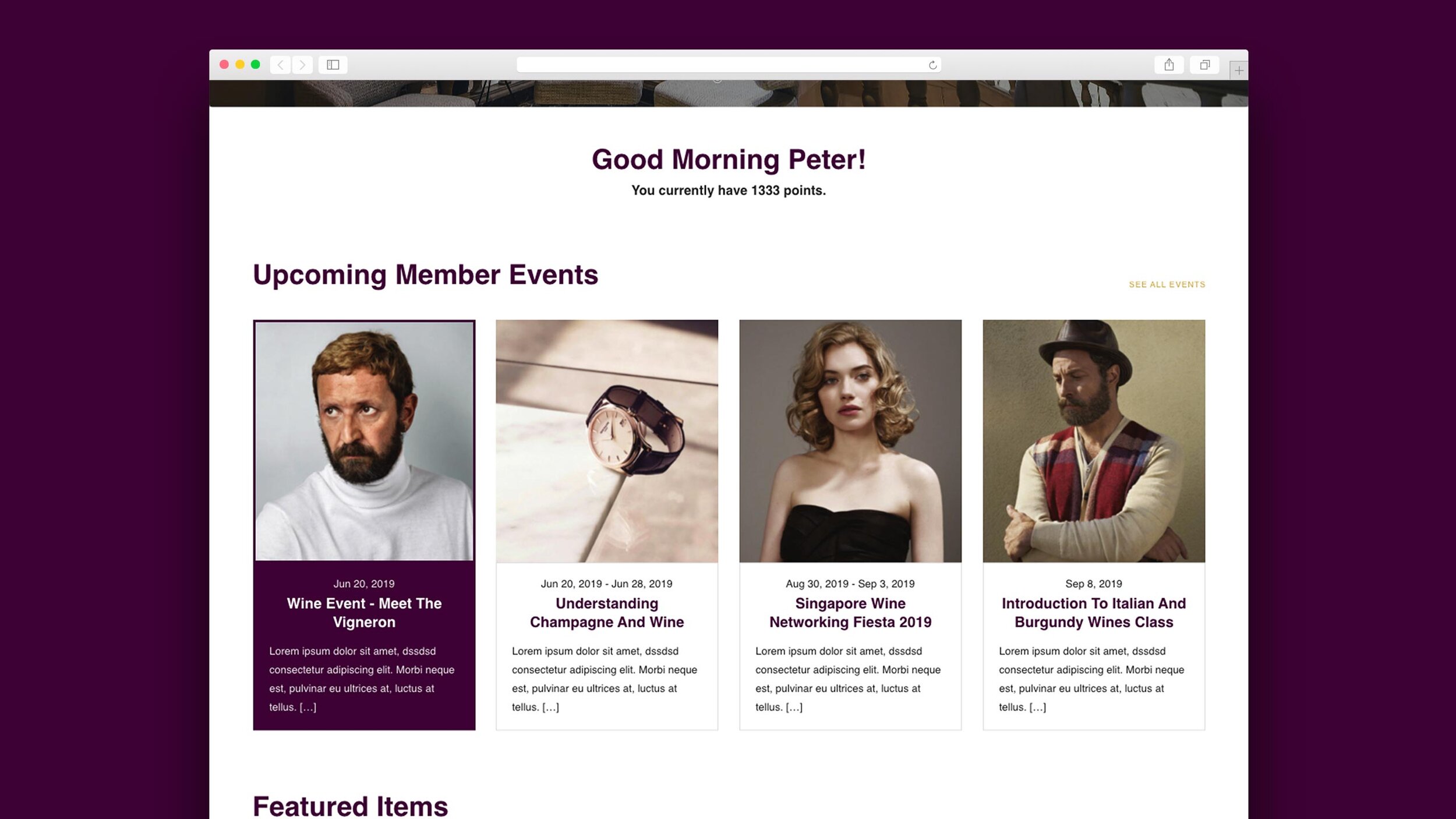
In this juncture, we all had alignment on how the website is going to be, and we had gained approval from the client to start designing the screens. They sent over their brand guide for point of reference so that I can move forward to create all the screens.


Creating the screens
I spent about a week working on creating the screens while getting some design feedback from my team along the way.

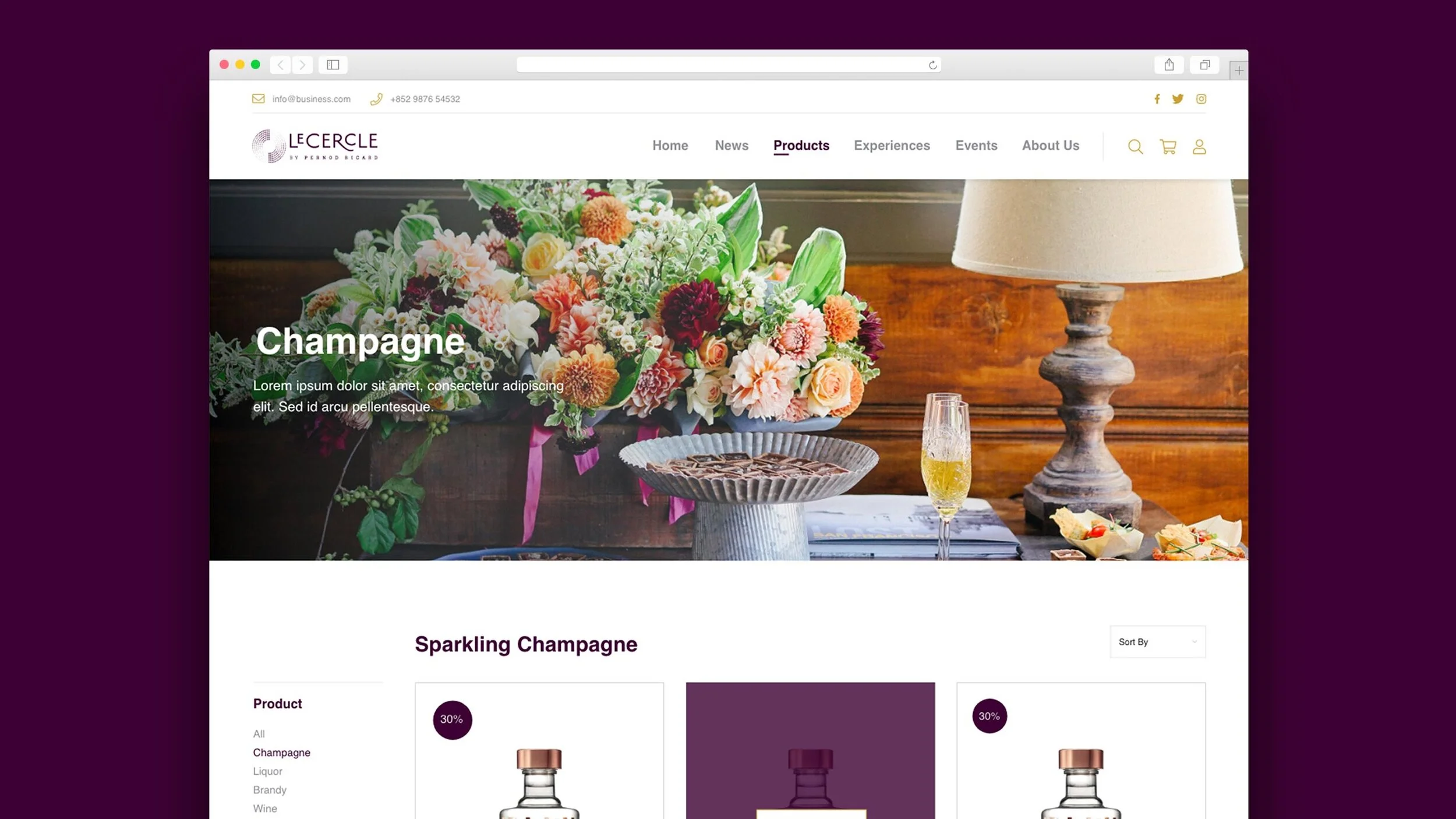
Hompage for non-member / public users.


Homepage for member users.


Event Page for both users.


Product page for member users.


Listing event page for both users.


Listing page for member users.

Other pages
Age gate, Dropdown cart list, Cart Page


Handover to developer
After the design is approved by the client, I handed over everything to the developer, Xin Yun, who worked on the development of the website.
With a few check-ins and user testing on all devices for 2-3 weeks, the phase one website is live!
Credits
CLIENT
Covalent Capital
CLIENT FOUNDER
Sanjay Garodia
DESIGN AGENCY
360 & 5
DESIGN DIRECTOR
Andrew Lim
SENIOR DESIGNER
Beiwen Wong
DESIGNER
Andy Ng
LEAD DEVELOPER
JJ Tan
DEVELOPER
Xin Yun Koh
BACKEND DEVELOPER
Syabil