THE PROBLEM
Covalent Capital is a Fin-tech company which creates shared systems and platforms that deliver cost, process and information efficiency to the debt markets. One of their platforms, OMAS Plus is facing usability problems such as displaying portfolio details, the status of bonds/investment and the overall user experience. This cause problems on how the sharing of new deal information and orders internally and externally on a real-time basis and how investors manage their orders directly.
THE SOLUTION
To improve on how the data and information are organised and displayed with the aid of colour-coding and filter integration.
THE ROLE
I was responsible for the design and user experience of the OMAS Plus platform. I partner with the project lead, JJ Tan, and we led the UI/UX efforts with ownership of all major design and sequence deliverables.
ROLES
UI/UX Designer
RESPONSIBILITIES
Wireframes
Interface Design
PLATFORM
Web
TOOLS
Pen and Paper
Adobe XD
Photoshop
Project
The task was to make a complete redesign of the live application OMAS Plus platform user interface and some part of the user experience. The application is a sub syndication tool for private banks and large funds that seamlessly connects relationship and portfolio managers to clients and central dealing desks.
The three main concerns in the client’s opinion were:
1) Outdated design
2) Hard to differentiate the different types of status in investment or bonds
3) Unpleasant user experience during user’s data entry
As instructed from the client, we have to keep the overall appearance design consistent with their other platform, OMAS. This was convenient for users who are going to use OMAS Plus, or vice versa, as they do not have to learn a different set of design language entirely
This was a very interesting and insightful project as the challenges we faced from this experience allowed the team to grow and learn.
Old Dashboard
This was the old dashboard interface that many of the user had problems using when trying to place an order for a bond or investment. They had difficulty identifying immediate status of each bond and the action of editing the deals.
The Approach
1) Partner with Project Lead to plan and define the application experience
2) Design the detailed designs and prototypes
3) Iterate designs based on feedbacks gathered during the meetings
UX Design
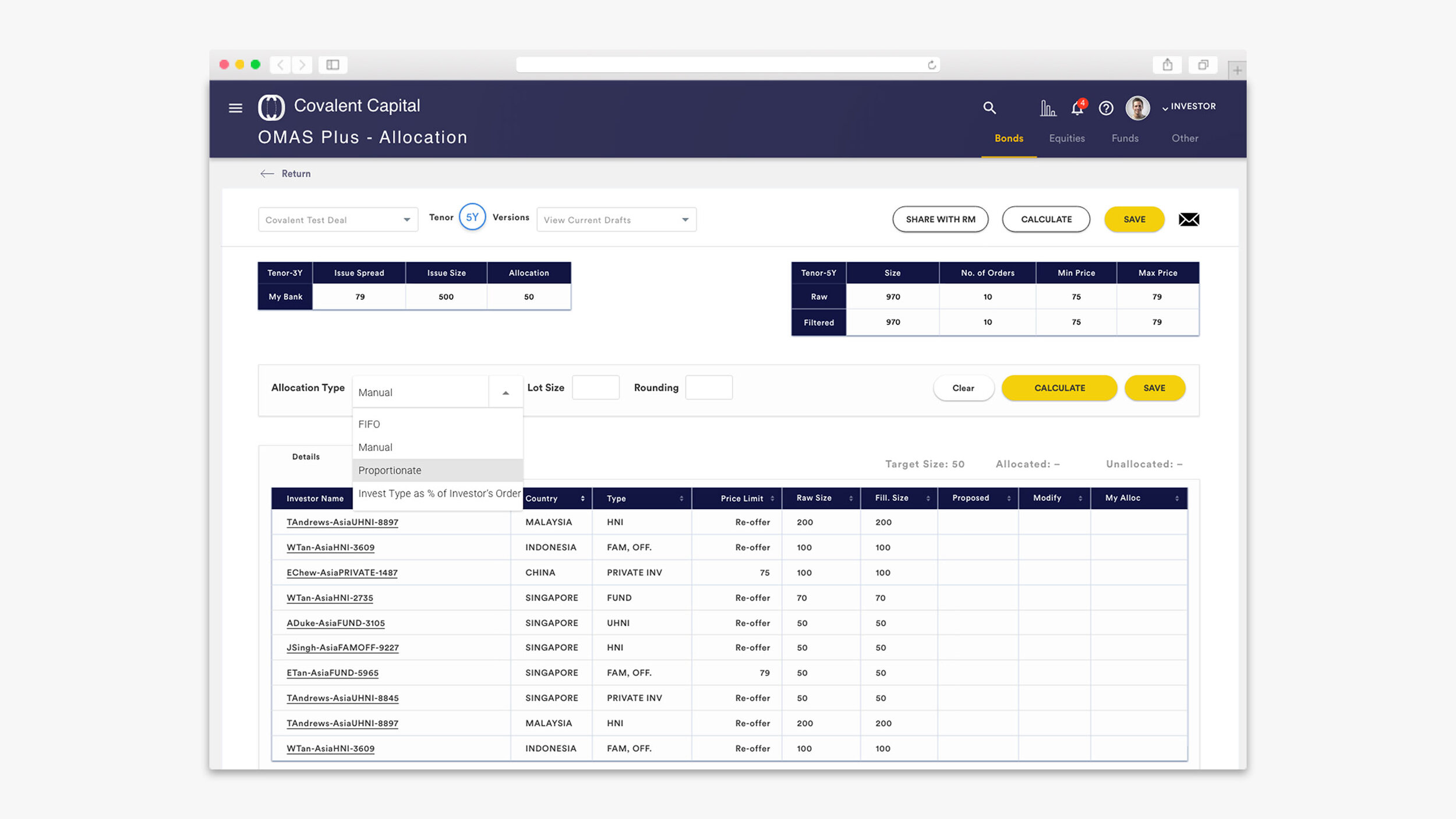
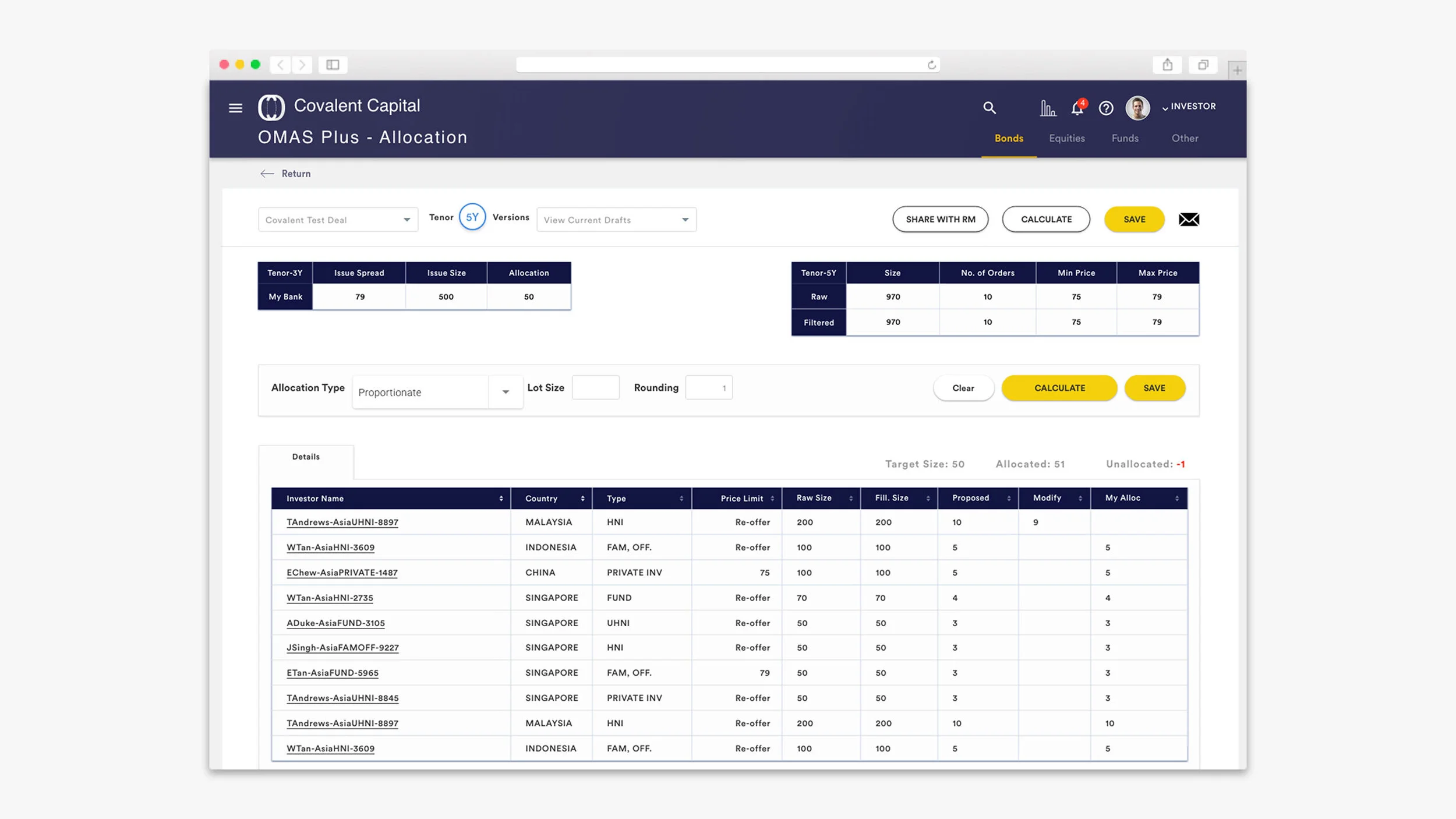
First of all, we decided to improve the UX by improving the interface design from scratch, ripping the system apart and building it back together again. This starts from making sure that the data and information is being organised and arranged properly. At this stage, we had to visualise the habits of the visual perception of information by users from the financial sector. Many users from this sector are used to seeing a huge amount of information on a single page.
(The image below is an example of how huge amount of information is being cramped in a single page. This is not OMAS Plus platform)
Information readily available
Most of the time, information readily available is worth much more than the same information a few seconds after. Therefore, placing tons of information in one screen is to make sure that they are never more than a couple of clicks away from a deal or bond. Looking at multiple information at the same time is more effective and efficient than having to constantly open up many tabs. Speed is crucial when trying to fill an order.
Therefore, we constantly had to make compromises regarding the amount of information or data to be shown on the page, as well as the density of text layout.
Another interesting feature we discovered and learned is the subconscious perception of colour coding. From our research, an example given was that in Western finance, the rise in the share price is indicated in green while the drop is in red. We decided to use colours to tell the status of a bond or deal to solve the problem.


Placing an order
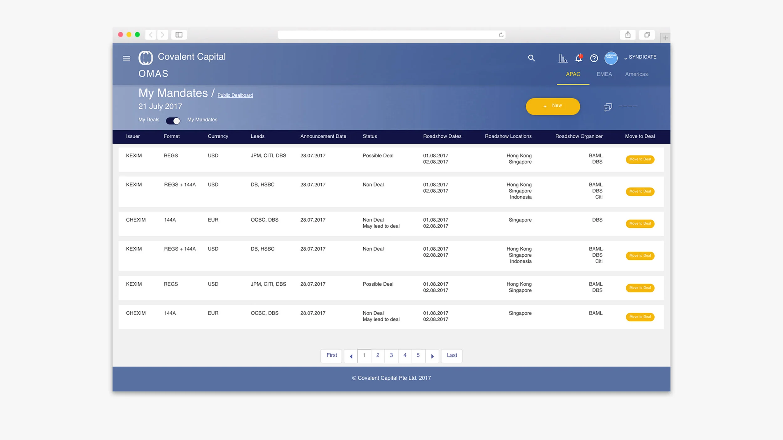
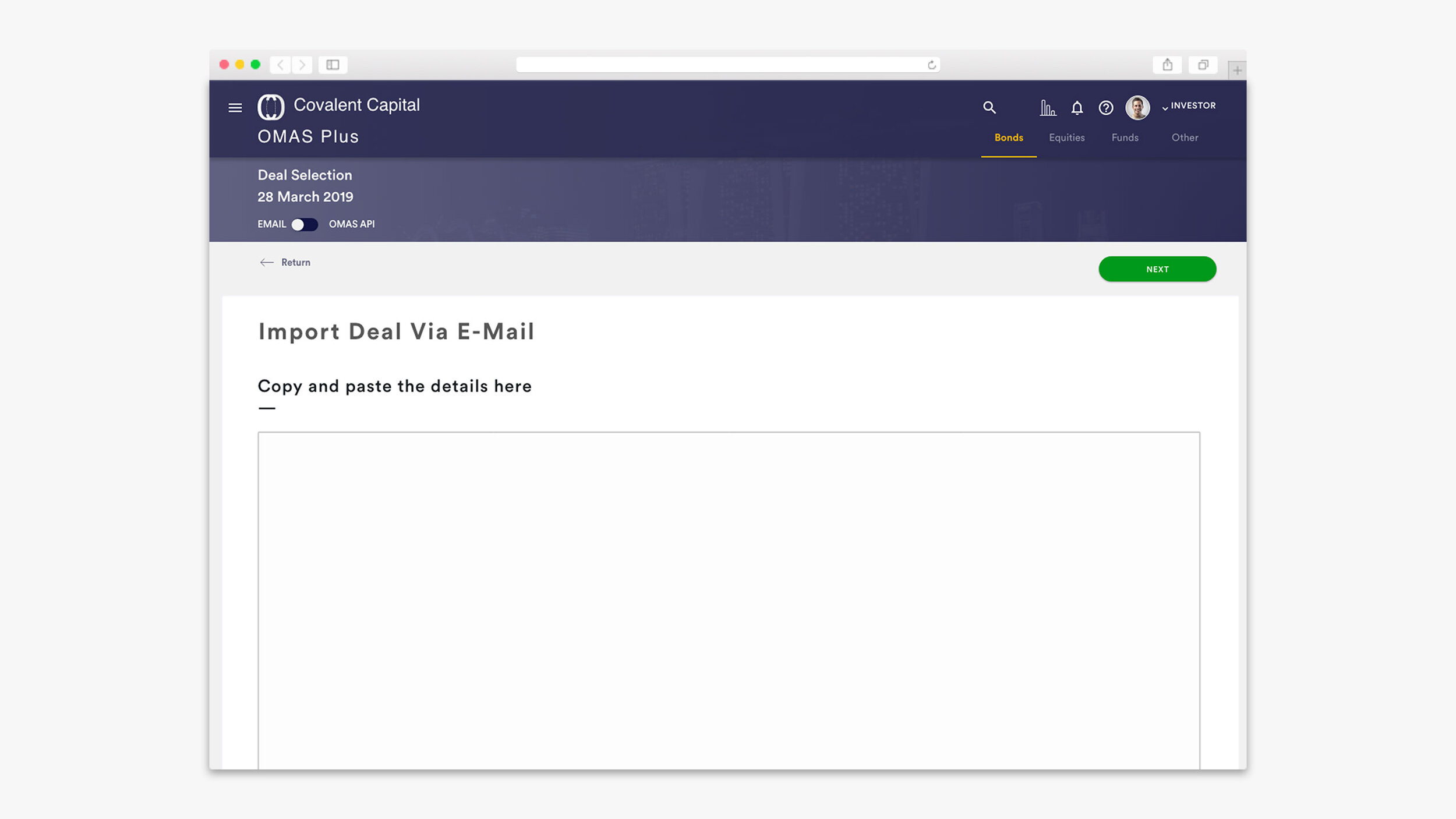
The interesting task at this stage was improving the user experience of placing an order for a bond or investment that the user can do to achieve their goals. Placing an order can be through importing a new deal via either OMAS API or EMAIL.
Placing an order via OMAS API
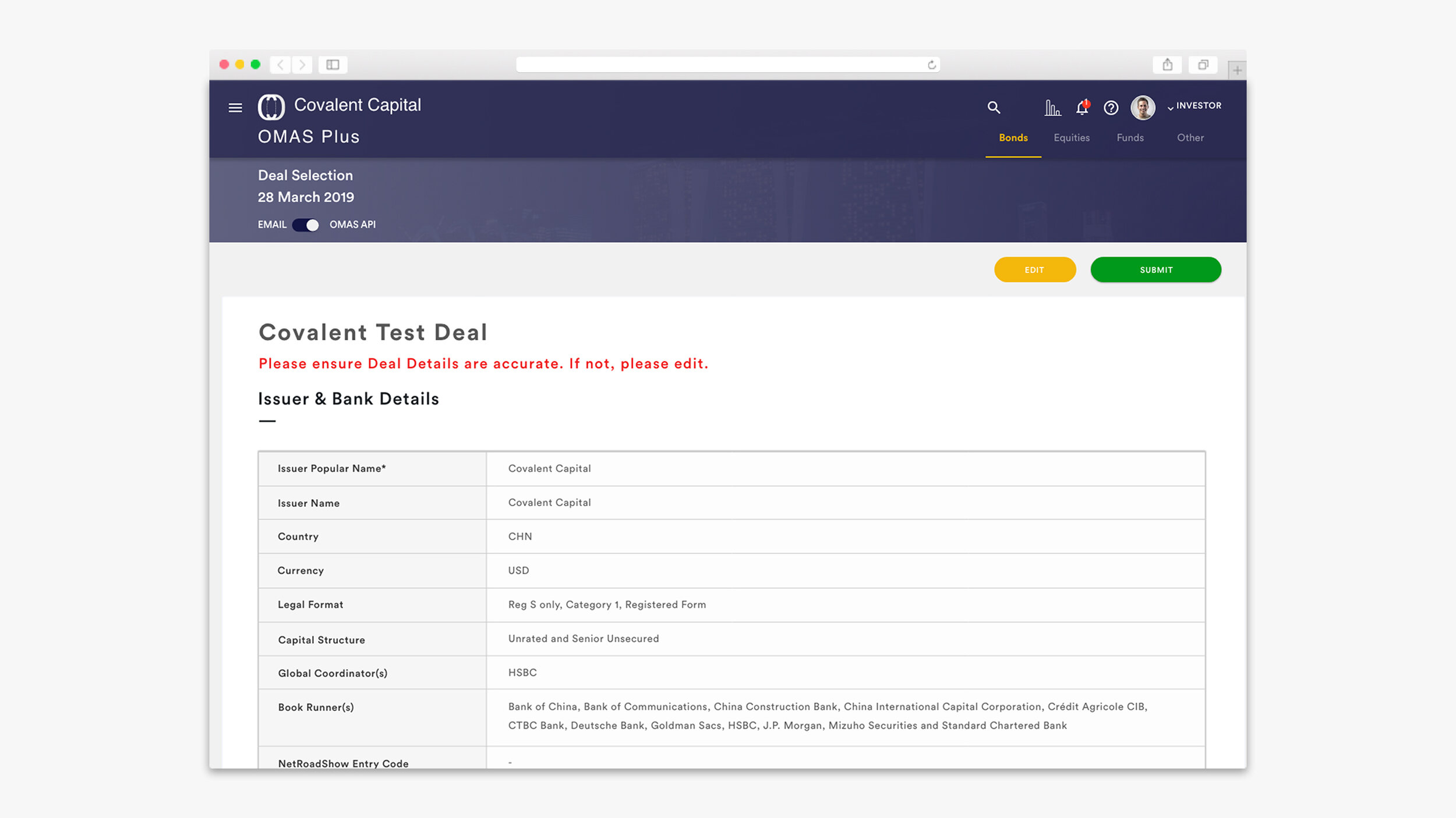
The whole process is being simplified, allowing the user to search for their available deals via the deal selection page which they can import the information straight into the deal details form which will then be auto-filled up for the user. This happened as the deal details consist of a huge amount of information with many different types of data. This issue is being solved by arranging and grouping the information into a category with an “EDIT” button on each category to allow the user to scan and make changes easily.


Previewing of deal details
User is then able to add in more information if needed or required from the application to fully place an order for a deal. Before submitting an order, the last step is a very crucial user experience which is to enable the user to have a preview of the entire deal details prior to final submission so that they are able to check and make amendments if necessary.


It’s a success
Moving forward, users are then able to share the deals with the user groups that they are interested in. At this stage, the deals will be successfully imported into the deal-board.
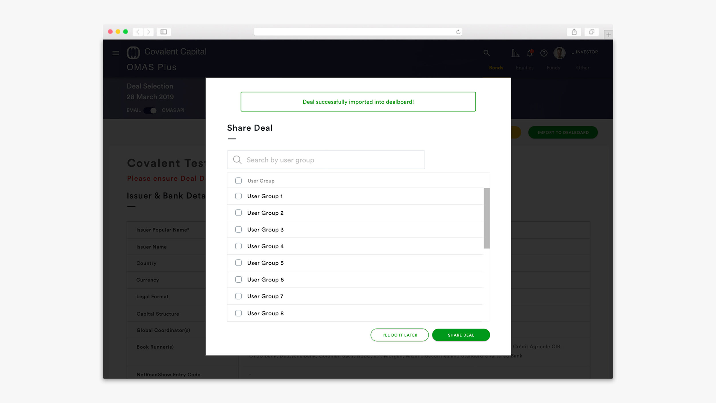

Notifications alert
Notifications will then alert you for any updates of the deals you had placed an order on.


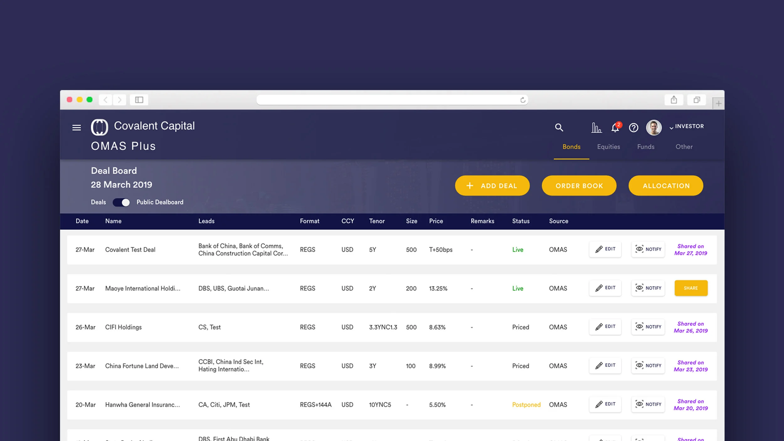
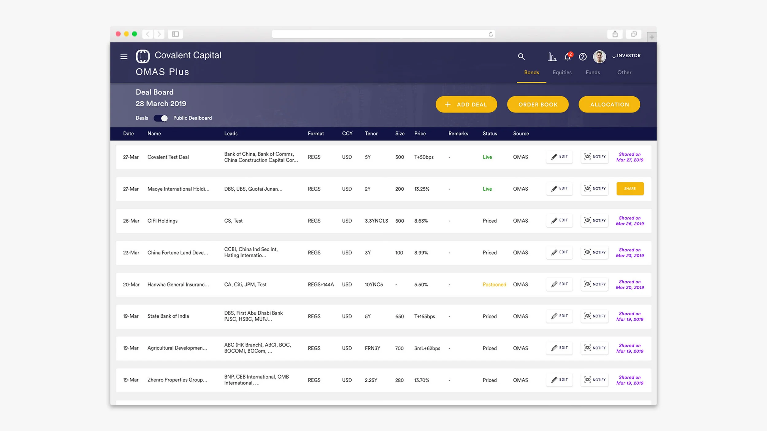
Colour coded
Colour coded is being introduced and implemented to help identify the different statuses of the deals. The properly selected colours help put users in the frame of mind that compels them to notice or take action. It can help to improve and advance the usability of the product.


Placing an order via Email
The only difference is in selecting “EMAIL”, the user is required to fill up the information that is being sent to their email. The following user flow after this is the same as OMAS API whereby it will go straight into the deal details form which will be auto-filled up for the user.

UI Design
For the visual of the application, we received instructions from the client to use dark shades of blue and created a clean interface for the application. The design leads to a small number of additional colours.


Better readability experience
Minimal use of colours help to create strong visual hierarchy to attract users’ eye to the most important elements on the screen and better readability experience as they scan through a large amount of information at one go.

New Dashboard
Based on the client’s requirements, they decided to include more data information for each deal to allow the user to have a better overview of the deals since most of their users require some specific information to make better choices.
Credits
CLIENT
Covalent Capital
CLIENT FOUNDER
Sanjay Garodia
DESIGN AGENCY
360 & 5
Project Lead
JJ Tan
DESIGNER
Andy Ng
LEAD DEVELOPER
-
DEVELOPER
-
BACKEND DEVELOPER
-